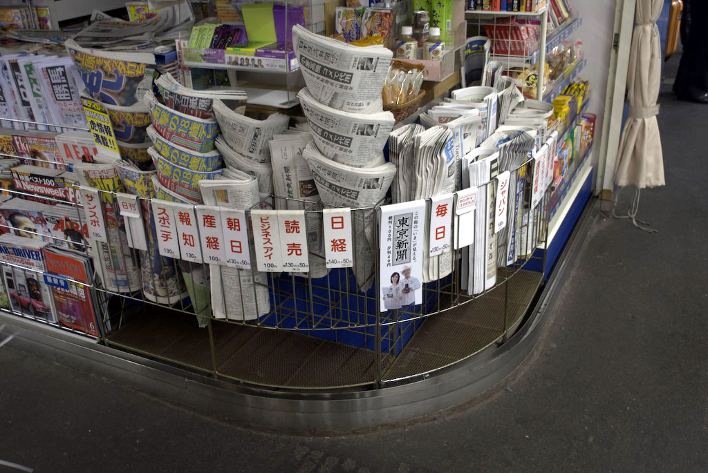
The extreme battle for space on this Shinagawa station convenience store dictates that newspapers are either folded and stacked vertically or, in the case of the more popular titles stacked like ice-cream cones. And whilst it’s possible to find more expansive newspaper displays that include clearly visible headlines – it is very much the local Japanese norm.
To what extent does the Japanese newspaper form effect people’s ambient awareness of (headline) news? Are the display norms a reflection of the particularly habitual purchasing behaviour of Japanese newspaper consumers? What attributes of how the newspaper is displayed e.g. densely folded, carry over into how the newspaper is browsed and read? And as with this discarded newspaper from the London underground (above), how does the disposal method affect ambient awareness?
Donning the service designr cap for a moment and given the answers to the above, how does ambient awareness affect the likely adoption of mobile news related services?