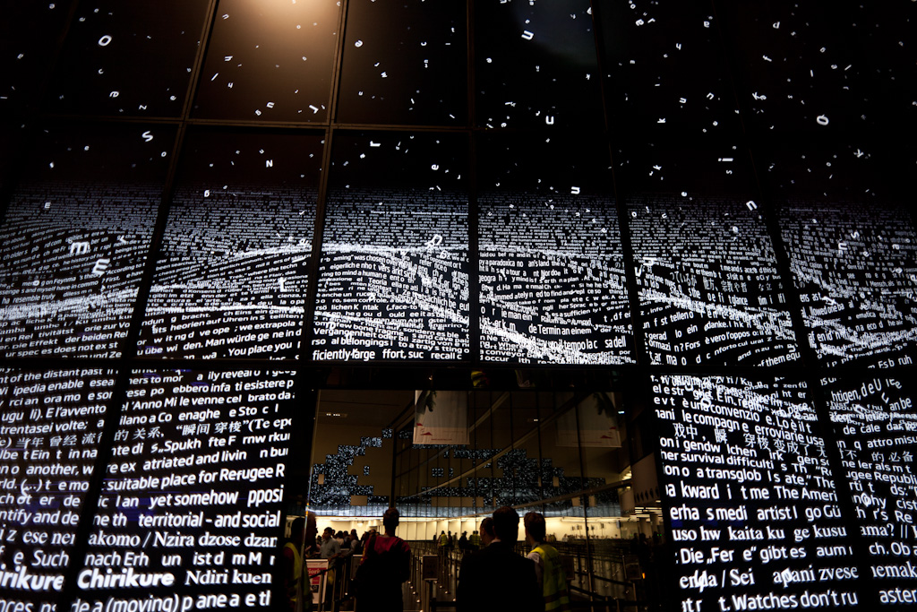
It’s been a while since I’ve passed through Vienna, pleasantly surprised at the balance between the functional aspects of the airport such as the information architecture and the the more experientially driven elements – including the ticket gate experience: everyone is pushed to do self-checkout; and the information visualisation display/exit behind the ticketing constantly shifting and swirling. Tastefully done, making Vienna standout.
See more at Zeitraum.
