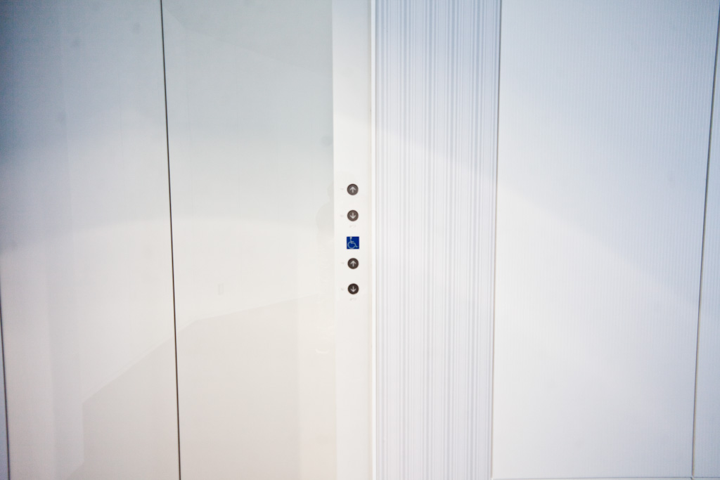
Rounding out a week of elevatoresque posts this button positioning for full-bodied customers (up/down buttons above) and wheelchair access customers (up/down buttons below).
Aside from being easier to reach, wheelchair users are probably familiar with the layout convention, including functional differences e.g. whether the doors stay open for longer, whether secondary activities inside the elevator are affected by their press.
