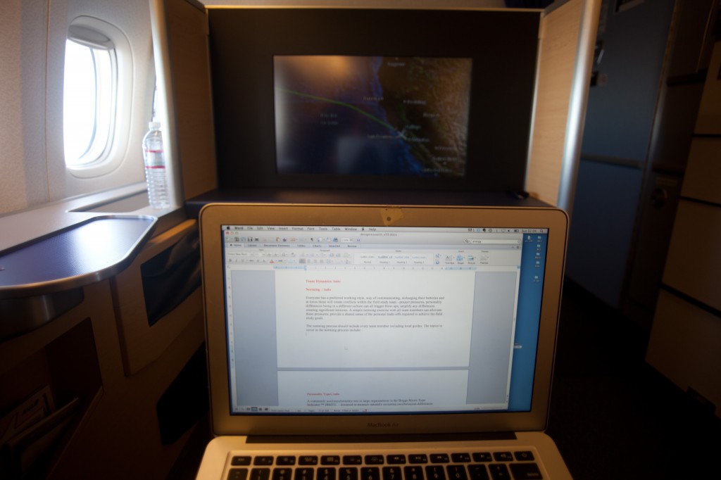
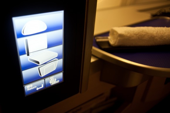
Seat adjustment interface in ANA first has shifted to full touch screen, a nice enough design, but in-use feels kinda cheap compared to more nuanced buttons. Aside from the functional differences should the visual design/look/feel/behaviour of a seat adjustment interface in first differ from one in Economy?
From en route to the US, I don’t know when.


