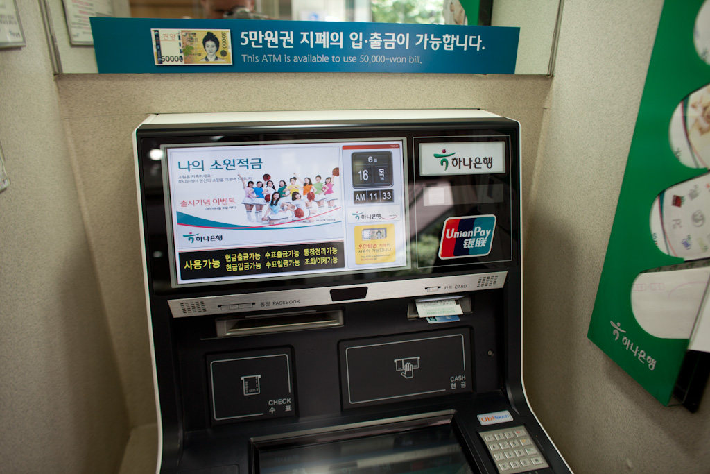
ATM includes the usual touchscreen (at the bottom of the photo) and a display that updates infrequently – to the unobservant eye it could just as well be static information.
So many people talk about adopting an n-screen strategy, without really considering the difference in screen literacy across and within markets. Seoul is still the screen capital of the world – with the highest degree of screen roll-out, experimentation, acceptance and quality. Quality is measured against a static, printed high quality poster viewed in passing – they have essentially had parity for a while, the cost of delivering up the digital display has been mainstream (in Seoul) for a few years now.
We’re still in the ‘look-ma no hands’ stage of utilising screens in urban design, but are slowly, slowly moving more towards a model that appreciates subtlety. Think high-quality displays that are, or mimic signage and are indistinguishable from a static sign, until they move.
