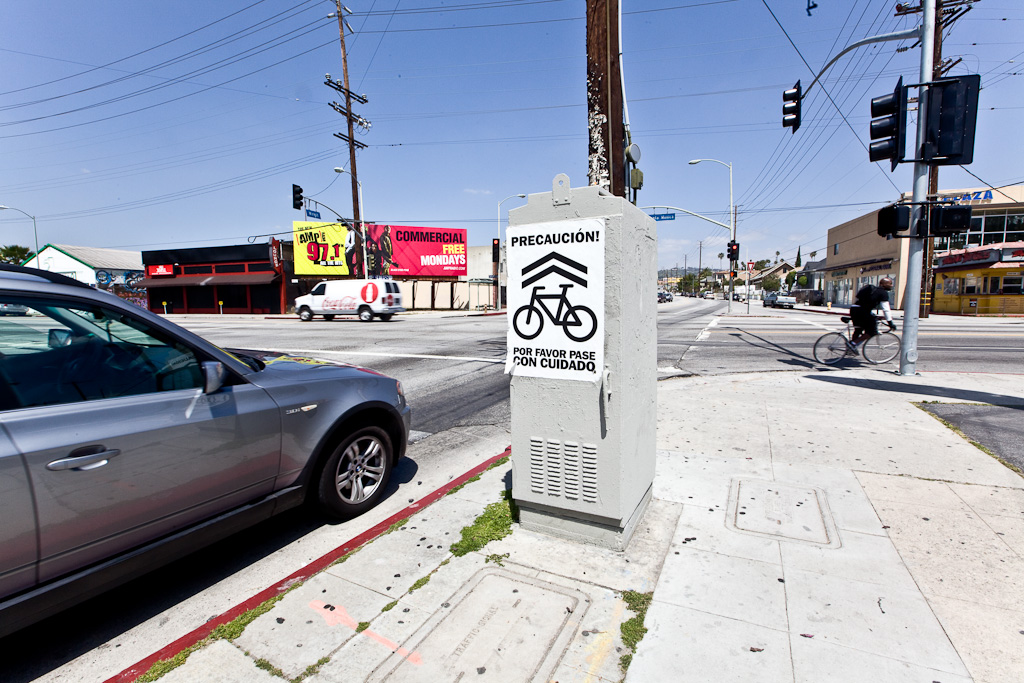
If you’ve driven around Los Angeles these past couple of weeks you’ll have come a across these DIY street signs with “Caution – Cycles – Please Pass With Care” – a Spanish language version from today’s jolly into Silver Lake above.
For every system there are layers of mandatory and optional official notation which are typically overlaid with personal and/or crowd sourced unofficial notation that better reflects the local or individual sentiments; the context; and/or the mood of the day. The relatively successful impact of this particular campaign is down to: consistent infrastructure close to traffic lights that supports a standardised sign; a transport-neutral message portrayed with good simple graphic design; and being able to mobilise enough people around the city to ensure it rapidly becomes widespread.
As with most signs – they will soon blend unnoticed into the graphic language of our urban infrastructure. Whether and how to update this campaign? What other messages could or indeed should be delivered through the same mechanism?
Los Angeles bicycle accident map here, and a little more on the people behind the caution cyclists campaign here.
