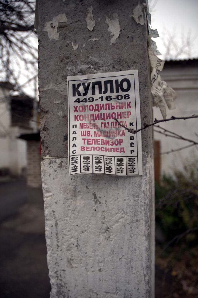
Advertising including tear-off strips found on this Tashkent lamp post – the same format is popular on the streets from Milan to San Francisco and beyond. The form factor supports taking away key information – usually someone’s contact details. In a world of ubiquitous personal communication devices you might assume there to be less of this kind of advertising – everything going online, right?
There are (at least) three reasons why this will not the case: the continued widespread availability of cheap desktop printing; the importance of placing advertising in a physical context; and the mainstreaming of devices that allow the consumer to act upon that information in that physical context e.g. make a call, access a web page.
Given the generally amateur nature of the format such as black and white photocopies, unevenly torn strips and the method of placement – what design tweaks would make this more big-corp-advertising friendly? Or, after years of being refined by the streets, is this already perfection?
