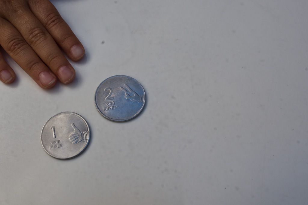
One for design focussed numismatists: the 1 and 2 rupee coins from a recent trip to India include fingers, in part as a way to communicate its value to illiterate consumers (India has a high number of illiterates). It’s largely decorative since illiterate/innumerate consumers are still able to rote learn the shape and form of the number 2. One coud argue that the fingers make the coinage explicitly inclusive to illiterate consumers.
The fingers should be a secondary cue of value the primary cues being it’s size, weight and material of the coin. This is unfortunate because the 1 rupee coin is of the same size as the prevailing 2 rupee coin – making it a very subtle primary design cue for people with both in their hand.
A poor tradeoff between visual literacy and good interaction design.
Kinda related – these signs from Tehran.